A common story
The Comic Sans font (from Microsoft) and the Jet colormap (from MathWorks) were created as a solution inside a software tool. Due to their mainline product success (Microsoft Windows and Matlab), these tools enjoyed wide popularity and adoption. Finally, both were deemed obsolete because of their misuse or practical limitations. Both fell victim to a tarnished reputation.
In its time, Comic Sans was being criticized for its childish appearance and its pervasive use in some inappropriate contexts like this one. (Governmental contracts, job applications, and gravestones to name a few). Some web pages like Comic Sans criminal and Ban Comic Sans created by graphic designers Dave and Holly Combs give us a glimpse into the opinion of some professional graphic designers on the topic. Besides all the critiques, some people enjoy it. Some people love the simplicity, the readability, and how playful it looks.
On the other hand, the Jet map was the first one Mathworks built into its scientific software toolkit MATLAB. With the adoption of Matlab, Jet became popular, and today you can find that almost all engineering simulation suites use a colormap similar to Jet for its visualizations. But Jet has a design problem. It changes color by increasing RGB values with linear ramps. But that is not how the human body perceives color. This design choice can make some non-existing patterns emerge in plots.
Just like Comic Sans. Jet gained some detractors. Many works like this one from Rogowitz et al.1, Borland et al.2, and Borkin et al.3 have shown different issues with the colormap. Even Mathworks has made a critique4 on its own colormap.
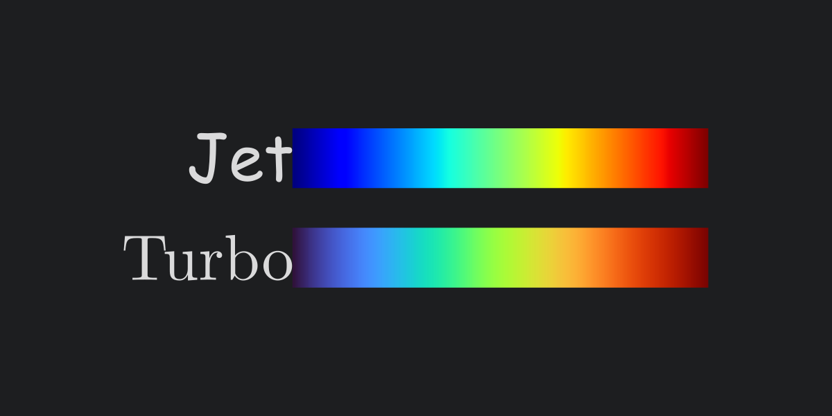
But let’s see how does Jet stands in front of more modern candidates in the following example:

All images plot the same data using different colormaps. We can see that Viridis (at the top), Grayscale (center), and Inferno (at the bottom) look similar. All of them can help you follow how values change. Some chromatic tones correspond to higher values, and others to lower ones. Then we have Turbo (at the right), a colormap from Google. This map has three different colors, which makes it more evident which values are near the data maximums and minimums. Finally, we have Jet on the left. This colormap shows some patterns that do not exist in the original data. Since those patterns won’t appear with any other color palette. Mainly due to the design choices of the colormap. Here goes a more direct comparison with Turbo.

The weird visual artifact happens due to the human brain’s way of perceiving color. A color map can’t satisfy itself with just increasing RGB values. It’s necessary to take a good model of human color perception into account. To learn about colormap design start here for the Viridis making-of and here for the Turbo colormap making-of.
But anyway, someone else did the hard work for us this time:

Extra links
On Comic Sans:
- A funny site adding beef to the comic sans controversy
- A Tumblr site criticizing Comic Sans
- Some nice logos recreated with comic sans
- Interview with the comic sans creator Vincent Connare
- Why you hate comic Sans, an article by David Kadavy
On colormaps:
- A video showing how different colormaps look when grayscaled
- Great video showing multiple colormaps in a very detailed simulation
- An article I took as inspiration


-
B. E. Rogowitz and L. A. Treinish, “Data visualization: the end of the rainbow,” in IEEE Spectrum, vol. 35, no. 12, pp. 52-59, Dec. 1998, doi: 10.1109/6.736450. ↩︎
-
D. Borland and R. M. Taylor Ii, “Rainbow Color Map (Still) Considered Harmful,” in IEEE Computer Graphics and Applications, vol. 27, no. 2, pp. 14-17, March-April 2007, doi: 10.1109/MCG.2007.323435. ↩︎
-
M. Borkin et al., “Evaluation of Artery Visualizations for Heart Disease Diagnosis,” in IEEE Transactions on Visualization and Computer Graphics, vol. 17, no. 12, pp. 2479-2488, Dec. 2011, doi: 10.1109/TVCG.2011.192. ↩︎
-
Rainbow Color Map Misuse. (n.d.). Retrieved April 7, 2023, from https://www.mathworks.com/content/dam/mathworks/tag-team/Objects/r/81137_92238v00_RainbowColorMap_57312.pdf ↩︎