For one project, I had to separate the legends from the plots. Doing such a thing can be tricky with the Matplotlib library or Seaborn. In this post, I will show how you can achieve the results in the cover image.
Just use this function:
 1
 2
 3
 4
 5
 6
 7
 8
 9
10
11
12
13
14
15
16
17
18
19
20
21
22
23
24
25
|
import pandas as pd
import numpy as np
import matplotlib.pyplot as plt
from sklearn.datasets import load_iris

def pandas_plot_standalone_legend(
        ax, filename, l_kargs={"frameon":False}
):
    handles_labels = [
        ax.get_legend_handles_labels() for ax in fig.axes
    ]
    handles, labels = [
        sum(lol, []) for lol in zip(*handles_labels)
    ]
    fig2 = plt.figure()
    legend = fig2.legend(
        handles, labels, **l_kargs
    )
    fig2.canvas.draw()
    bbox = legend.get_window_extent().transformed(
        fig2.dpi_scale_trans.inverted()
    )
    fig2.savefig(
        filename, bbox_inches=bbox
    )
|
It takes the handles and labels Matplotlib objects of the plot. Then it inserts them in a standalone figure. Once that’s done, crop the white spaces.
Example time
Let’s test this function in a well-known dataset. The content of this article can be applied to plots created through Matplotlib, I just used a Pandas DataFrame to build a quick example.
We load it this way:
1
2
3
4
5
6
7
8
9
|
# %% Quick dataset
data = load_iris()
targets = data.target
data_total = np.concatenate(
    (data.data, targets[:,None]), axis=1
)
df = pd.DataFrame(
    data_total, columns=[*data.feature_names, "targets"]
)
|
You can apply this two ways.
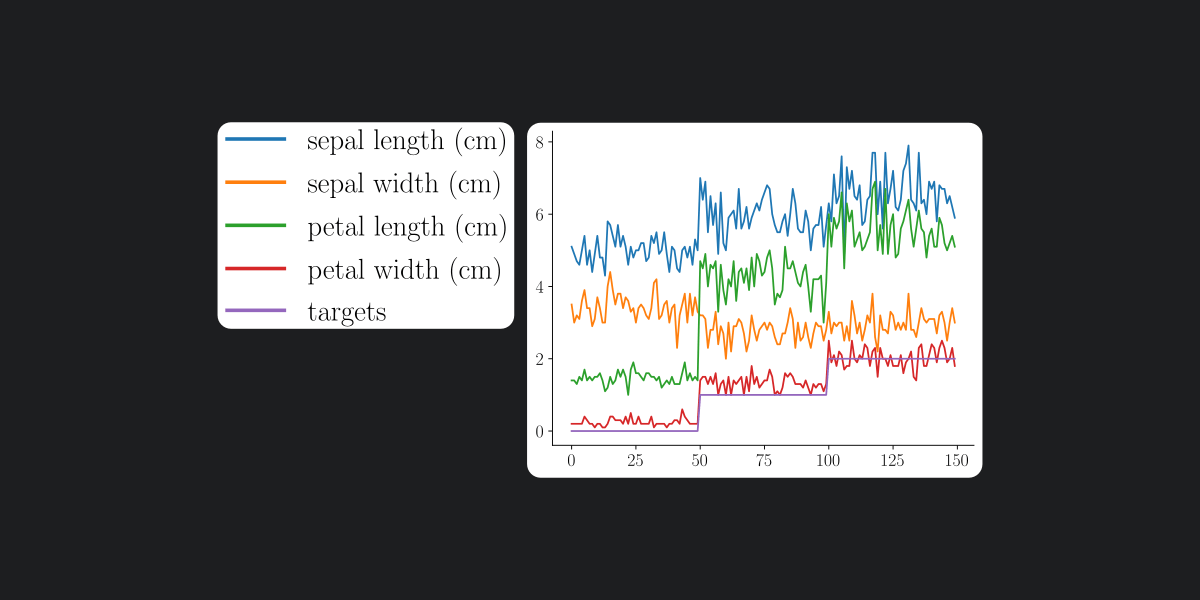
To obtain a result like so:


We use this piece of code
1
2
3
4
5
6
7
8
|
# %% No subplots
fig, ax = plt.subplots()
df.plot(
    ax=ax, sharex=True
)
pandas_plot_standalone_legend(ax, "iris_legends.pdf")
ax.legend().set_visible(False)
fig.savefig("iris.pdf")
|
As you can see, we need to hide the legend in the axes where you plot the data with “ax.legend().set_visible(False)”. The legend is saved separately in the file iris_legends.pdf.
In case you want to plot every field of the dataset in different axis, do as follow:
1
2
3
4
5
6
7
8
9
|
# %% With subplots
fig, ax = plt.subplots()
axes = df.plot(
    subplots=True, ax=ax, sharex=True
)
pandas_plot_standalone_legend(axes, "s_iris_legends.pdf")
for one_ax in axes:
    one_ax.legend().set_visible(False)
fig.savefig("s_iris.pdf")
|
The two results are:


Hope you find it helpful.